Stylesheets
.
A stylesheet is another way to give a tree its CSS. Keep using
h.style
for values computed from your model, and use classes when you want shared rules, themes, or a CSS processor such as Tailwind. Both paths feed the same property resolver.The plan picker, with a sheet
Live: this is the program below, running
Solo
One person
$0
Team
Up to ten people
$12
Company
Everyone
$40
This is the plan picker of Styling, with every style moved into a CSS file. Click a plan, move the pointer over the others, press Tab. The program only names classes:
examples/src/core/plans_sheet.silk
Copy
//! The plan picker again, styled by a stylesheet. The view names classes, and
//! `docs/styles/plans.css` holds every value.
import
loom.lib { Document
, Node
, NoCommand
, NoOutput
, Program
, Role
, Update
}
import
silk.mem.allocator { Allocator
, OutOfMemoryError
}
pub
struct
Plans
{
/// The plan that is chosen: 0, 1 or 2.
pub
chosen: u32,
}
pub
union
Message
{
ClickedPlan
{ pub
plan: u32 },
}
type
Next
= Update
<Plans
, NoCommand
, NoOutput
>
impl
Program
<Message
, NoCommand
> for
Plans
{
effect
fn
init
() -> Next
! OutOfMemoryError
? &mut
Allocator
{
return
Next
.of
(Plans
{ chosen: 1
})
}
effect
fn
update
(mut
model: Plans
, message: Message
) -> Next
! OutOfMemoryError
? &mut
Allocator
{
match
move
message {
Message
.ClickedPlan
{ plan } => {
model.chosen = plan
}
}
return
Next
.of
(move
model)
}
fn
view
(model: &Plans
, h: &Document
<Message
>) -> Node
{
return
h.box
(
&[h.accessRole
(Role
.Group
), h.label
("Plan"
), h.class
("plans"
)],
&[
plan
(h, model, 0
, "Solo"
, "One person"
, 0
),
plan
(h, model, 1
, "Team"
, "Up to ten people"
, 12
),
plan
(h, model, 2
, "Company"
, "Everyone"
, 40
),
],
)
}
}
/// One plan, as a card that can be chosen.
fn
plan
(
h: &Document
<Message
>,
model: &Plans
,
index: u32,
name: string,
about: string,
dollars: i64,
) -> Node
{
let
chosen = model.chosen == index
return
h.button
(
&[
h.accessRole
(Role
.Radio
),
h.checked
(chosen),
h.onClick
(Message
.ClickedPlan
{ plan: index }),
// What depends on the model is one more class. Hover, press and focus are in the sheet.
h.class
(if
chosen { "plan chosen"
} else
{ "plan"
}),
],
&[
h.box
(
&[h.class
("plan-body"
)],
&[
h.box
(&[h.class
("plan-name"
)], &[h.text
(name)]),
h.box
(&[h.class
("plan-about"
)], &[h.text
(about)]),
h.box
(&[h.class
("plan-price"
)], &[h.text
("$"
), h.number
(dollars)]),
],
),
],
)
}The sheet holds the values. The colors are custom properties on the picker, the pointer and focus states are selectors, and the chosen card is one more class:
styles/plans.css
Copy
/* The plan picker of plans_sheet.silk, which only names these classes. */
.plans {
--ink: #1f2937;
--muted: #6b7280;
--line: #d1d5db;
--accent: #0f766e;
display: flex;
column-gap: 12px;
padding: 16px;
color: var(--ink);
}
.plan {
flex: 1 1 0;
padding: 14px;
border: 1px solid var(--line);
border-radius: 12px;
background-color: #ffffff;
transition: border-color 150ms ease, background-color 150ms ease;
}
/* A style that follows the pointer is a selector. The model never hears of it. */
.plan:hover {
border-color: var(--muted);
}
.plan:active {
translate: 0 1px;
}
/* A style that follows the model is a class the view adds. */
.plan.chosen {
border-color: var(--accent);
background-color: color-mix(in srgb, var(--accent) 8%, white);
}
.plan:focus-visible {
border-color: var(--ink);
}
.plan-body {
display: flex;
flex-direction: column;
row-gap: 4px;
align-items: flex-start;
}
.plan-name {
font-weight: 700;
}
.plan-about {
color: var(--muted);
font-size: 13px;
}
.plan-price {
margin-top: 8px;
font-size: 20px;
font-weight: 700;
}
The frame above runs on the browser's DOM, so the browser applies the sheet. In a window or on a canvas there is no browser CSS: Silk UI's own tree matches the selectors, runs the cascade and draws the result on the GPU. This is the same program and the same file drawn that way:
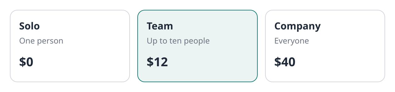
The plan picker in a window, styled by plans.css. Where the browser has WebGPU it runs here.
Load CSS at build time
In
silk/tasks.silk
, add files to the app definition in cascade order:Silk
Copy
App
.make
("my-app"
)
|> App
.framework
(Framework
.loom
("app"
))
|> App
.stylesheet
("styles/app.css"
)
|> App
.stylesheet
("styles/theme.css"
)The pipeline accepts ordinary CSS. It compiles and embeds sheets for native windows and WebGPU canvas apps, and links the original CSS for DOM pages. Compiled sheets are adopted before the first layout. Release hosts decode compiled sheets instead of parsing stylesheet text at startup.
In the view, use a literal class string:
Silk
Copy
h.
box
(
&[h.class
("card"
), h.id
("summary"
), h.attribute
("data-state"
, "ready"
)],
&[h.text
("Ready"
)],
)Output
Copy
@layer components {
.card {
--card-gap: 12px;
padding: var(--card-gap);
border-radius: 8px;
background-color: oklch(96% 0.02 250);
}
.card:hover { background-color: color-mix(in oklab, white 80%, blue); }
.card[data-state="ready"] { border: 1px solid currentColor; }
}
silk task dev
watches configured sheets and replaces their rules without resetting application state. A missing or invalid update keeps the previous sheet until a valid replacement arrives. Editing Silk code still rebuilds the application.Classes and inline styles
Sheet declarations follow CSS specificity, source order, layers and
!important
. The node's style object has the place of an inline style: it overrides normal sheet declarations, while important sheet declarations override normal inline values. State looks and state selectors read the same interaction state.Custom properties inherit through the tree and can be written on either side.
h.customProperty("--card-gap", "16px")
sets an inline variable; a declaration using var(--card-gap)
can read a value from a sheet or an ancestor. @property
supplies registered defaults and inheritance behavior. Values such as var()
, calc()
, oklch()
and color-mix()
share the resolver used by style objects.Selectors read element tags, IDs, classes, named attributes and state.
data-*
and literal aria-*
attributes can be matched. Literal ARIA relation values name element IDs within the same root; typed protocol relations continue to use node numbers. Numeric aria-valuemin
, aria-valuemax
, and aria-valuenow
values also update native accessibility while retaining their literal spelling for selectors. Native ValueRange
attributes expose the corresponding selector attributes. Explicit native roles and tab indices can be matched with [role]
and [tabindex]
; implicit defaults leave those attributes absent.Tailwind
Tailwind writes a CSS file from the classes it finds in your source, and the app loads that file like any other stylesheet. Silk UI itself has no Tailwind dependency.
Live: this is the program below, running
Inbox
Dark
Switches the theme
Welcome to Silk
Mark read
Your build passed
Mark unread
Review the release notes
Mark read
Move the pointer over a row and over the Dark button, click a row, switch the theme. Every style here is a Tailwind class in the view:
examples/src/core/inbox_tailwind.silk
Copy
//! A small inbox styled with Tailwind's variants: rows that react as a group, a hint that
//! follows its neighbour, zebra rows, dividers, a data attribute and a dark theme.
import
loom.lib { Document
, Node
, NoCommand
, NoOutput
, Program
, Update
}
import
silk.mem.allocator { Allocator
, OutOfMemoryError
}
import
silk.num.u32
pub
struct
Inbox
{
/// Which of the three messages have been read.
pub
read: [bool; 3
],
pub
dark: bool,
}
pub
union
Message
{
ClickedMail
{ pub
index: u32 },
ClickedTheme
,
}
type
Next
= Update
<Inbox
, NoCommand
, NoOutput
>
impl
Program
<Message
, NoCommand
> for
Inbox
{
effect
fn
init
() -> Next
! OutOfMemoryError
? &mut
Allocator
{
return
Next
.of
(Inbox
{ read: [false
, true
, false
], dark: false
})
}
effect
fn
update
(mut
model: Inbox
, message: Message
) -> Next
! OutOfMemoryError
? &mut
Allocator
{
match
move
message {
Message
.ClickedMail
{ index } => {
model.read[u32.toUsize
(index)] = !model.read[u32.toUsize
(index)]
}
Message
.ClickedTheme
=> {
model.dark = !model.dark
}
}
return
Next
.of
(move
model)
}
fn
view
(model: &Inbox
, h: &Document
<Message
>) -> Node
{
return
h.box
(
// `dark:` classes below apply inside a node with the class `dark`.
&[h.class
("p-4"
), h.classWhen
(model.dark, "dark"
)],
&[
h.box
(
&[
h.class
("w-[min(100%,26rem)] rounded-xl border border-gray-200 bg-white text-gray-800"
),
h.class
("dark:border-gray-700 dark:bg-gray-900 dark:text-gray-100"
),
],
&[
h.box
(
&[h.class
("flex items-center gap-2 p-3"
)],
&[
h.box
(&[h.class
("flex-1 font-bold"
)], &[h.text
("Inbox"
)]),
// `peer` names this button for the siblings after it.
h.button
(
&[
h.onClick
(Message
.ClickedTheme
),
h.class
("peer rounded-md px-2 py-1 text-[13px] hover:bg-gray-100 dark:hover:bg-gray-800"
),
],
&[h.text
(if
model.dark { "Light"
} else
{ "Dark"
})],
),
h.box
(
&[h.class
("text-[12px] text-gray-500 opacity-0 transition-opacity peer-hover:opacity-100"
)],
&[h.text
("Switches the theme"
)],
),
],
),
// `divide-y` draws a line between the rows, not around them.
h.box
(
&[h.class
("divide-y divide-gray-200 border-t border-gray-200 dark:divide-gray-700 dark:border-gray-700"
)],
&[
mail
(h, model, 0
, "Welcome to Silk"
),
mail
(h, model, 1
, "Your build passed"
),
mail
(h, model, 2
, "Review the release notes"
),
],
),
],
),
],
)
}
}
/// One message. Clicking it marks it read or unread.
fn
mail
(h: &Document
<Message
>, model: &Inbox
, index: u32, subject: string) -> Node
{
let
read = model.read[u32.toUsize
(index)]
return
h.button
(
&[
h.onClick
(Message
.ClickedMail
{ index: index }),
h.attribute
("data-state"
, if
read { "read"
} else
{ "unread"
}),
// `group` names the row for its descendants; `has-[.dot]` reads one of them back.
h.class
("group flex items-center gap-3 p-3 odd:bg-gray-50 hover:bg-teal-50 last:rounded-b-xl has-[.dot]:font-semibold"
),
h.class
("dark:odd:bg-gray-800 dark:hover:bg-gray-700"
),
],
&[
h.box
(&[h.class
("size-2 rounded-full"
), h.classSelect
(read, "bg-transparent"
, "dot bg-teal-600"
)], &[]),
h.box
(&[h.class
("flex-1 group-data-[state=read]:text-gray-500"
)], &[h.text
(subject)]),
h.box
(
&[h.class
("text-[12px] text-teal-700 opacity-0 transition-opacity group-hover:opacity-100 dark:text-teal-300"
)],
&[h.text
(if
read { "Mark unread"
} else
{ "Mark read"
})],
),
],
)
}And the same inbox in a window, where the tree applies the sheet Tailwind wrote and the GPU draws it:
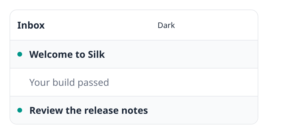
The Tailwind inbox in a window. Where the browser has WebGPU it runs here: hover a row, click it, switch the theme.
Start with a template
The quickest way is a template that has everything below in place:
Shell
Copy
silk init my-app -t ui-loom-tailwind
cd my-app
silk task dev
ui-react-tailwind
, ui-foldkit-tailwind
and ui-js-tailwind
do the same for JavaScript apps.Add Tailwind to a Loom app
1.
Add the Tailwind step to the tasks dependencies in
silk.toml
, at the same revision as silkui
:toml
[profiles.tasks.dependencies]
silkui = { git = "https://github.com/silk-lang/silkui.git", rev = "<rev>", path = "modules/silkui", package = "silkui" }
tailwind = { git = "https://github.com/silk-lang/silkui.git", rev = "<rev>", path = "modules/tailwind", package = "ui-tailwind" }
2.
Choose where Tailwind comes from. Either install it in the project with
npm install tailwindcss @tailwindcss/cli
, or copy tailwind.lock.json
into the project. With the lock file, the step downloads the standalone Tailwind program once, checks its SHA-256 and caches it, so the project needs no Node installation.3.
Write
styles/input.css
. It imports Tailwind and names the Silk files to read classes from:css
@import "tailwindcss" source(none);
@source "../silk/**/*.silk";
4.
In
silk/tasks.silk
, load the file Tailwind writes, and run Tailwind around the build: `silk
import tailwind.tailwind { Tailwind }
effect fn app() -> App ! OutOfMemoryError ? &mut Allocator {
return run App.make("my-app")
|> App.framework(Framework.loom("app"))
|> App.stylesheet("styles/app.css")
|> App.target(Target.window(Window { title: "My app", width: 420.0, height: 200.0 }))
}
`
silk
let processor = Tailwind.make("styles/input.css", "styles/app.css")
match move self {
// Builds the CSS, then keeps Tailwind watching while the app runs.
Tasks.Dev { platform: _, options } => run processor.watching(app()
|> App.dev(&options)
|> Built.launch()
|> Running.watch())
Tasks.Build { platform: _, options } => {
drop run processor.build()
run app() |> App.build(&options) |> Built.write("dist")
}
}
5.
Add
styles/app.css
to .gitignore
: it is build output.6.
Use classes in the view, and run
silk task dev
. Saving a Silk file adds its new classes to the sheet, and the running app takes the new sheet without losing its state.The Tailwind step's page covers musl Linux, a project in a subfolder and updating the pinned version.
Classes in the view
Tailwind finds classes by reading your source as text, so each class has to appear whole in a string.
"bg-" + color
is invisible to it; if danger { "bg-red-600" } else { "bg-teal-600" }
works.Class attributes on one node add up, so a node can take its classes in pieces instead of in one long string:
Silk
Copy
h.
box
(&[
h.class
("rounded-xl border p-4"
),
h.classWhen
(model.busy, "opacity-50"
),
h.classSelect
(chosen, "border-teal-700 bg-teal-50"
, "border-gray-300 bg-white"
),
h.classes
(&[CARD
, SPACING
]),
], children)classWhen
adds its classes while the condition holds. classSelect
adds the first string while it holds and the second otherwise. classes
adds every string in a list. className
replaces what the node has so far.Here is the plan picker of this page again with Tailwind. A card's fixed classes are one attribute and the chosen look is another:
examples/src/core/plans_tailwind.silk
Copy
//! The plan picker a third time, with Tailwind classes. Tailwind reads the literal
//! class strings in this file and writes the CSS for them.
import
loom.lib { Document
, Node
, NoCommand
, NoOutput
, Program
, Role
, Update
}
import
silk.mem.allocator { Allocator
, OutOfMemoryError
}
pub
struct
Plans
{
/// The plan that is chosen: 0, 1 or 2.
pub
chosen: u32,
}
pub
union
Message
{
ClickedPlan
{ pub
plan: u32 },
}
type
Next
= Update
<Plans
, NoCommand
, NoOutput
>
impl
Program
<Message
, NoCommand
> for
Plans
{
effect
fn
init
() -> Next
! OutOfMemoryError
? &mut
Allocator
{
return
Next
.of
(Plans
{ chosen: 1
})
}
effect
fn
update
(mut
model: Plans
, message: Message
) -> Next
! OutOfMemoryError
? &mut
Allocator
{
match
move
message {
Message
.ClickedPlan
{ plan } => {
model.chosen = plan
}
}
return
Next
.of
(move
model)
}
fn
view
(model: &Plans
, h: &Document
<Message
>) -> Node
{
return
h.box
(
&[h.accessRole
(Role
.Group
), h.label
("Plan"
), h.class
("flex gap-3 p-4 text-gray-800"
)],
&[
plan
(h, model, 0
, "Solo"
, "One person"
, 0
),
plan
(h, model, 1
, "Team"
, "Up to ten people"
, 12
),
plan
(h, model, 2
, "Company"
, "Everyone"
, 40
),
],
)
}
}
/// One plan, as a card that can be chosen.
fn
plan
(
h: &Document
<Message
>,
model: &Plans
,
index: u32,
name: string,
about: string,
dollars: i64,
) -> Node
{
let
chosen = model.chosen == index
return
h.button
(
&[
h.accessRole
(Role
.Radio
),
h.checked
(chosen),
h.onClick
(Message
.ClickedPlan
{ plan: index }),
// Tailwind finds classes by reading this file, so each one is written out whole.
h.class
("flex-1 basis-0 rounded-xl border p-3.5 transition-colors active:translate-y-px focus-visible:border-gray-800"
),
h.classSelect
(chosen, "border-teal-700 bg-teal-50"
, "border-gray-300 bg-white hover:border-gray-500"
),
],
&[
h.box
(
&[h.class
("flex flex-col items-start gap-1"
)],
&[
h.box
(&[h.class
("font-bold"
)], &[h.text
(name)]),
h.box
(&[h.class
("text-[13px] text-gray-500"
)], &[h.text
(about)]),
h.box
(&[h.class
("mt-2 text-xl font-bold"
)], &[h.text
("$"
), h.number
(dollars)]),
],
),
],
)
}Variants
The inbox above uses these, and the tests of the docs examples check each one on a real tree:
In the example
What it does
hover:bg-teal-50
, focus-visible:…
, active:…
The node's own pointer and focus state
group
on the row, group-hover:opacity-100
inside itA descendant follows the row's state
group-data-[state=read]:text-gray-500
A descendant follows an attribute of the row, set with
h.attribute("data-state", …)
peer
on the button, peer-hover:opacity-100
after itA later sibling follows the button's state
has-[.dot]:font-semibold
The row follows what it contains
odd:bg-gray-50
, last:rounded-b-xl
Position among siblings
divide-y divide-gray-200
Lines between children
dark:bg-gray-900
A
dark
class on an ancestor, see belowtext-[13px]
, w-[min(100%,26rem)]
Arbitrary values
Hover variants are written inside
@media (hover: hover)
. Windows and pages report a pointer that can hover; a tree you build yourself in a test needs tree.setStylePreferences(Preferences.desktop(false))
first.Without configuration,
dark:
follows the system's color scheme. To switch it from your model, declare the variant in the input file and put the class on a node around the themed part with h.classWhen(model.dark, "dark")
:styles/inbox.tailwind.input.css
Copy
/* What Tailwind reads. `build-tailwind.sh` writes inbox.tailwind.css from it. */
@import "tailwindcss" source(none);
@source "../examples/src/core/inbox_tailwind.silk";
/* `dark:` follows a `dark` class on an ancestor instead of the system setting. */
@custom-variant dark (&:where(.dark, .dark *));
JavaScript apps
Import CSS from the Vite entry. With Tailwind, add
@tailwindcss/vite
before the Silk plugin:JavaScript
Copy
import
tailwind from
"@tailwindcss/vite"
;
import
silk from
"@silkui/vite"
;
export
default { plugins: [tailwind
(), silk
({ entry: "src/main.ts"
})] };JavaScript
Copy
import
"./app.css"
;@silkui/vite
compiles Vite's processed CSS into dist/app.sheet
; the app pipeline embeds it. Development CSS updates replace sheets in the running tree. React uses className
, Foldkit uses h.Class
, and core nodes expose className
, classList
, id
and named attribute methods. In JavaScript, build conditional class strings as you would on the web, with template strings or a helper such as clsx
; the same rule holds that each class appears whole in the source.To construct a sheet dynamically, enable
App.runtimeStylesheets()
for a release host. Development hosts already include the text compiler. After mounting a root:JavaScript
Copy
import
{ CSSStyleSheet, root } from
"@silkui/core"
;
const
sheet = new
CSSStyleSheet
();
sheet.replaceSync
(".card { padding: 20px; }"
);
root
().adoptedStyleSheets = [sheet];These are the browser's names:
replaceSync(text)
compiles the text and swaps the rules before it returns, and returns nothing. replace(text)
is the other one: it returns a promise that resolves to the sheet once the rules are in. CSSStyleSheet.fromCompiled(bytes)
and replaceCompiled(bytes)
need no text compiler. Replacing a sheet preserves its place in the adoption order.Runtime sources
Custom Silk hosts can load CSS text with
StyleSheet.load(&mut tree, run StyleSource.text(bytes))
, or a URL with tree.loadStyleSheet(root, run StyleSource.url(url))
. Install the runtime compiler on the host loader, or use App.runtimeStylesheets()
with a generated host. A compiled-only host rejects text loads before starting network I/O.A handle exposes loading, ready or failed state, and methods to replace or remove the sheet. Loads reserve their cascade position immediately. A failed replacement preserves the old rules; a completion arriving after removal or another replacement is discarded.
Native file and HTTP reads run on workers. Canvas fetches follow browser URL and CORS rules; local files must be served over HTTP. DOM uses browser stylesheets and needs no Silk compiler option.
Browser differences and current limits
On
web-dom
, the browser implements CSS. Window and canvas targets use the tree's CSS implementation:•
There is no HTML document stylesheet collection or HTML user-agent stylesheet. Nodes without an explicit tag match as
div
; tags such as h1
do not bring browser default styles. Sheets belong to a tree root.•
Class, attribute, structural, combinator, state and
:has()
selectors, layers, nesting, custom properties, @property
, @media
and @supports
are supported. Shadow DOM selectors match nothing.•
Media queries use the root's viewport and scale. Canvas also receives browser preference and pointer changes. Native windows supply appearance and desktop pointer capabilities; native reduced-motion and forced-colors preferences are not exposed by the platform API yet.
•
CSS transitions and
@starting-style
rules use the existing motion engine, including custom properties, cascade priority, and entry after display: none
. Starting styles inherit the parent’s normal after-change style, as in the browser. Inspector overrides apply after motion.•
Sheet
@keyframes
use the same animation engine as inline keyframe definitions. Names are scoped to the root, with layer, adoption and media-condition ordering. Keyframe values resolve variables per node; replacing the sheet preserves the animation's clock. Important declarations override animated values. Animating custom properties themselves is not implemented and produces a build warning.•
::before
and ::after
on box nodes support string and attr()
content, including empty strings. Generated boxes participate in layout, paint, motion, and accessible names; pointer actions target their originating node. Counters, quote controls, and image content remain unsupported.•
::selection
on inputs supports foreground and background colors, with a separate highlight inheritance chain, custom properties, origin states, and container queries. Transparent foregrounds replace selected ink; rich-text runs share the input highlight. Selection text shadows and decoration overrides remain incomplete. Selectors for unavailable parts such as ::marker
, ::backdrop
, and ::file-selector-button
produce build diagnostics.•
::placeholder
supports fonts, foreground and background colors, opacity, text spacing, and text decorations. It has its own font metrics and container-unit dependencies, without changing typed text or rich runs. Its line height remains normal
; layout, writing-mode, and text-shadow overrides, and part transitions and animations, are not implemented.•
::-webkit-scrollbar
, ::-webkit-scrollbar-thumb
, and ::-webkit-scrollbar-track
style the existing overlay scrollbars. Solid backgrounds, borders, corner radii, visibility, and scrollbar width and height are supported; painting and dragging share the styled dimensions. Origin states, container queries, and relative units work. Standard scrollbar-width: thin
or none
takes precedence over vendor part rules. The native overlay does not reserve a layout gutter, retains its native minimum thumb size and default appearance, and has no buttons or corner part. Part states (such as ::-webkit-scrollbar-thumb:hover
), gradients, shadows, and part motion remain unsupported.•
Size container queries support
container-name
, container-type: size
and inline-size
, physical and logical dimensions, ranges, boolean conditions, and query lists. The six container units (cqw
, cqh
, cqi
, cqb
, cqmin
, cqmax
) also work in style objects, grid tracks, transforms, paint effects, and keyframes. Layout settles within the same frame while preserving motion. Missing unit axes fall back to the viewport. Style and scroll-state queries remain unsupported.•
Sheet
@font-face
supports family, weight and width ranges, normal/italic/oblique faces, Unicode subsets, local()
sources, and ordered URL alternatives through the host font loader. Fonts load when text needs them, remain scoped to their root, and respond to media conditions, layer/adoption order, replacement, and removal. URL-loaded sheets resolve font URLs against the requested stylesheet URL using RFC 3986 reference resolution; redirect response URLs are not currently exposed by the loader. Loaded faces are cached for the tree’s lifetime, so unchanged rules reuse data across removal and HMR. Tree hosts use swap behavior for font-display: auto
and swap
; other display timing policies, descriptor math, and font metric/feature overrides produce diagnostics. Build-time App.stylesheet
inputs embed local font files, resolving relative paths from the original CSS file and /
paths from the app root. Vite bundles imported, emitted, and public font assets for production; development URLs point to its asset server and update through HMR. Nested runtime @import
loading remains unsupported.•
Ordinary lengths, transforms, grid tracks, and paint effects use measured font bases for
ch
, ex
, cap
, lh
and their root-relative forms. Relative font sizes use parent metrics; other lengths use the resolved element font and line height. The same bases apply to starting styles, keyframes, and rich-text runs; font-size animations update dependent lengths in the same frame. Some compound value grammars remain incomplete.•
Unknown properties, vendor selectors and other dropped features produce compiler diagnostics. Vite's
strictStylesheets: true
option can turn diagnostics into a build failure. Tailwind preflight includes browser-specific form-control rules that the tree drops.•
Local class, pointer-state and focus changes restyle the affected subtree, including changes to rules that set custom properties. So does a changed style object that sets no custom properties, and so does anything set on a node before it joins the tree. Inserting or removing a node restyles that node and what the root's selectors can read from it: the parent for
:empty
, the neighbouring elements for :first-child
, :last-child
and :only-child
, the parent's subtree for sibling combinators, :nth-*
and *-of-type
. A change that a sibling combinator or :nth-child(… of …)
filter can observe restyles the parent's subtree. :has()
dependencies, :focus-within
, class changes that touch display
, content
or all
, other attribute changes on attached nodes and inline custom properties restyle the root, and so does every pass once a root holds more than 4,096 distinct variable scopes. Equal sibling elements, and the matching children of equal siblings such as the cells of list rows, share one matched style and skip selector matching, unless the root's sheets use sibling combinators, :nth-*
or *-of-type
selectors, or :has()
; other repeated cascade results are shared after matching. Nodes that share a matched style this way also copy one set of computed values instead of applying the declarations again, while no transition or animation exists in the tree and the node has no focus, transition or container units of its own. Style-object-only roots avoid selector matching.The tree's property coverage suite checks the supported declarations through both style objects and compiled sheets. A stylesheet does not add rendering support for a property the tree does not yet implement.
Repeated rows styled by classes cost about as much memory as inline styles; creating them costs up to 4% more and a theme change up to 1.12 times as much. Elements with distinct classes still pay full selector matching and compute their own values. The stylesheet benchmark report records the instruction counts and storage measurements.
The local Chromium stylesheet comparison checks computed values and box geometry against three committed CSS fixtures. Its case table covers these utility families:
Coverage
Utilities or behavior
Compared with Chromium
Numeric padding, margins, gaps, width/height constraints, flex/grid layouts and alignment, border widths/radii/colors, foreground/background colors, font size/weight, line height, letter spacing, and opacity
Compared state combinations
Hover and group-hover, checked peers, disabled opacity, focus-visible outlines, data attributes, dark classes, responsive grids, nesting, layers, important declarations, and
:has()
Separate tree tests
Motion, container queries, generated content, font loading, text shaping, selection, placeholders, and overlay scrollbars
Host differences
No HTML user-agent styles; native overlay scrollbar sizing and preferences as described above
Dropped by the fixture compiler
Unavailable browser form-control parts, vendor-only selectors/properties, and
text-box
; unexpected diagnostic changes fail the comparisonThis table describes the checked cases, not every class emitted by Tailwind. See the comparison's
cases.json
for the exact combinations; unsupported compound values and parts still follow the limits above.Next: Images and fonts.